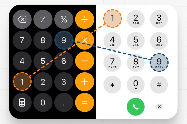
Hey there! Ever wondered why your phone and calculator keypads seem to be playing on opposite days? It’s not just to confuse us, I promise! Let’s dive into this quirky design mystery.
Calculator Chronicles:
Picture this: it’s way back when, and accountants are crunching numbers faster than we can say “tax season.” Calculators were their trusty sidekicks, and speed was the name of the game. That’s why they put 1, 2, and 3 at the bottom—it was all about rapid-fire data entry. Imagine those number wizards flying through calculations with their nimble fingers!
Phone Plot Twist:
Fast forward to the swinging 60s. Bell Labs (the cool cats of the tech world back then) were scratching their heads over a new phone design. They went full-on science mode, testing layouts like they were auditioning for a Broadway show.
The winner? Our now-familiar 3×3 grid with the lonely 0 hanging out at the bottom. But here’s the kicker—it wasn’t the speed demon of the bunch. So why’d they pick it?
The Logic Behind the Buttons:
Turns out, Bell Labs was thinking big picture. They chose a layout that vibed with how our brains are wired to read: top to bottom, left to right. It’s like they designed the keypad to be a mini book!
The Lightbulb Moment:
Here’s where it gets really interesting. The Bell Labs folks taught us a super valuable lesson: sometimes, the best design isn’t about being the fastest or even the fan favorite. It’s about creating something that feels as natural as breathing.
Think about it—when was the last time you had to think about where the numbers are on your phone? Exactly! It’s become second nature. That’s the magic of intuitive design.
Global Impact:
This decision didn’t just affect the US—it shaped phone design worldwide! From bustling cities in Japan to rural villages in Africa, people everywhere use this same layout. It’s a tiny example of how design choices can connect us all.
Food for Thought:
So next time you’re punching in a phone number or tallying up your grocery bill, take a second to appreciate the thought behind those buttons. It’s a small reminder that good design is everywhere, making our lives easier in ways we don’t even notice.
Stay curious, folks! There’s always more to learn about the everyday objects around us. Who knows what other design secrets are hiding in plain sight?
What do you think? Does this make you see your phone or calculator in a new light? Do you have any other everyday mysteries you’re itching to solve? Let me know!
Throwing: Varun Kashetty


